Healthcare4 min
Patient experience in clinic and pharmacy design: waiting, wayfinding, privacy and light
A healthcare space starts speaking at the door. How waiting areas, wayfinding, privacy and lighting shape the patient's experience in clinics and pharmacies.
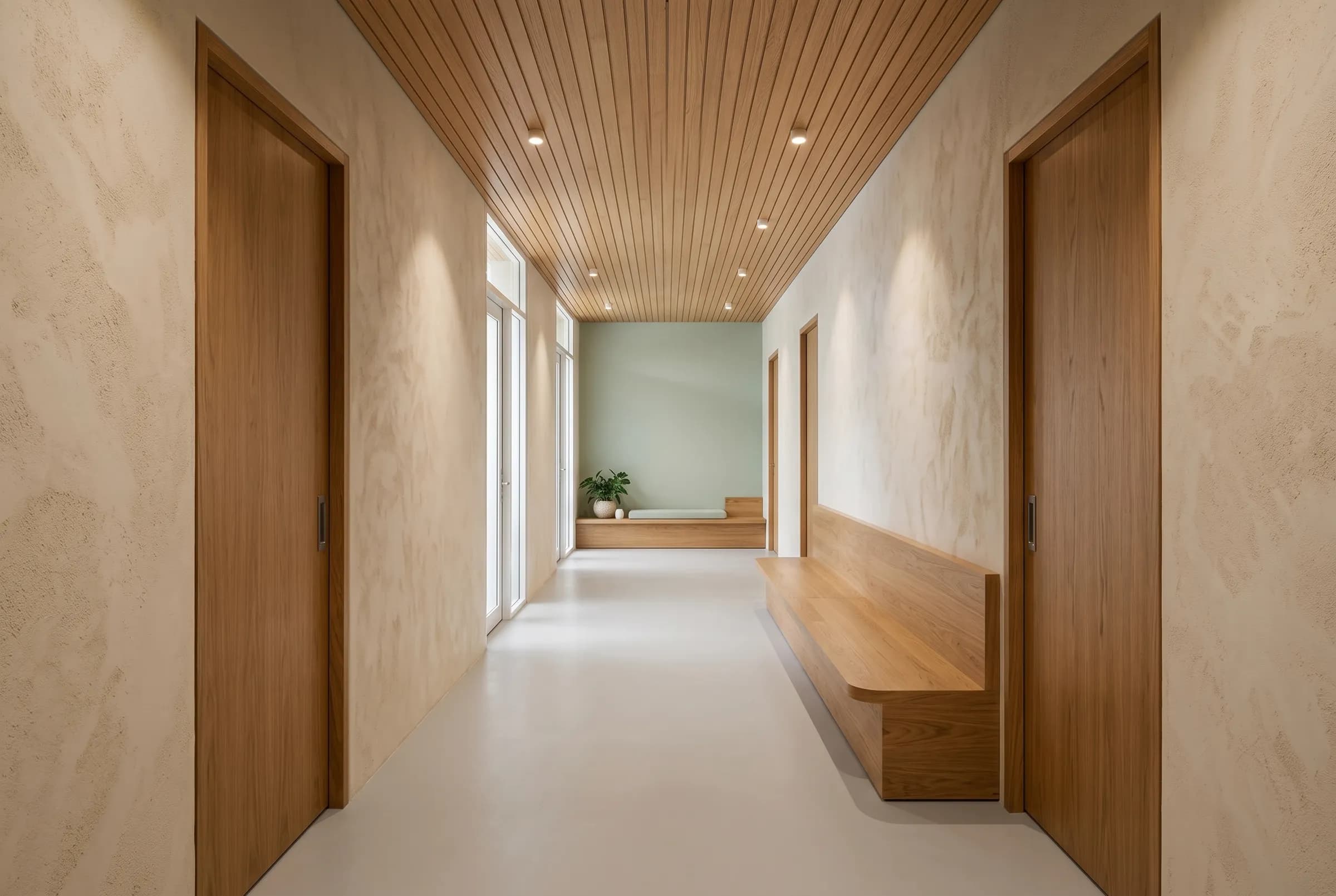
People entering a healthcare space are often tense. They are worried about themselves or someone close to them, unsure where to go, and about to wait. The space can make that harder or easier. In clinic and pharmacy projects we look at the patient's experience through four themes: waiting, wayfinding, privacy and light.
Waiting: you cannot shorten the time, but you can change how it feels
Design does not remove waiting, but it changes how waiting feels. Rows of chairs facing each other turn the person waiting into someone being watched. Seating broken into small groups, chairs facing different directions, corners where one can sit alone and a separate spot for a family with children all make the wait easier to bear.
Firmness and height of seating matter. An elderly patient or someone in pain struggles to rise from a very low seat; armrests help. A waiting area with daylight feels completely different from an enclosed corridor. Being able to see the door, the reception desk and the call display from one's seat saves the patient from getting up to check again and again.
In a pharmacy the wait is shorter but spent standing. A small area where a customer can step aside while a prescription is prepared, instead of standing at the counter, eases the queue and protects privacy at the same time.
Wayfinding: signage makes up for what the plan could not
In a well-planned healthcare space people rarely need signs. When reception is the first thing seen at the entrance, when the corridor shows where it leads and consulting rooms follow a natural order, most of the wayfinding is already done. Signage builds on that; it does not replace it.
Where signs are needed the rules are simple: large, high-contrast lettering, the same wording everywhere, and placement at decision points. Colour can distinguish zones, but colour alone is not enough and should be backed by text. A change in floor or wall colour tells people silently that they have moved from one area to another.
In a pharmacy, wayfinding is the shelf layout. Sensible grouping of over-the-counter products, a counter visible from the entrance and a clear start to the queue all reduce hesitation.
Privacy: not being overheard, not being seen
Privacy in a healthcare space has two layers, visual and acoustic. Conversations at the reception desk should not carry into the waiting area, the screen of the person registering patients should not be readable by others, and a consulting room should not be visible from the corridor when its door opens.
Most of this is decided in the plan. Distance between the desk and the seating, a clear line where people wait their turn one at a time, a short turn inside the consulting room door, door glazing that can be covered when needed. Materials help too: sound-absorbing ceilings and wall surfaces, floors that are quiet underfoot yet easy to clean.
The pharmacy counter is the most sensitive point. Prescriptions, drug names and dosages are spoken aloud. Dividing the counter into several stations, placing low screens between them and, where possible, opening a separate consultation corner lets the person being served speak without the next in line hearing.
Light: for the task and for calm
Lighting in a healthcare space does two different jobs at once. Examination, preparation and reading prescriptions need sufficient, shadow-free light of the right colour. In waiting and circulation areas that same hard light is tiring; warmer, more diffuse light that stays out of the eyes brings calm.
The two should not blur together. Running the same fitting across the whole ceiling turns a waiting room into a treatment room. Light colour and level by zone, fittings that control glare, no sources shining straight into the eyes of someone lying down, and daylight wherever it can be had are the basic principles.
In the pharmacy the same balance holds between shelves that show products clearly and a counter lit for reading. The shop window, meanwhile, tells the passer-by that the pharmacy is open.
How we approach it
In healthcare projects we begin by tracing the patient's route step by step, from the door in to the door out. At each step we ask what they see, what they hear and where they wait. Most of the solutions appear during that walk; materials and colour come after.
Get in touch to talk about your project.
TEF İç Mimarlık